And while some nonprofit organizations were set-up to take advantage of this (although still having to deal with many challenges), there were others who were exposed to a whole new landscape (one which offers lots of opportunities too!).
One thing’s for sure, whether you’re new to online fundraising or a seasoned digital campaigner, it’s good practice to continuously try to improve how your donation pages are performing and to look at how the donation page fits into the entire donor experience.
In this blog, we’ll look at a couple of ways to do that. And we’ll also show you how to implement some of these in your Salesforce org using FinDock Giving Pages.
Keep the message simple & focussed
First off, try not to overwhelm your donors with too much information. Instead, stay focussed on helping them complete the intended action on the donation page with engaging and relevant information. Some content check-boxes you can think about:
1. What is the cause, 2. How they can help (donate), 3. What action they must take, and 4. How will this impact the cause?
You can get creative and add a few more engaging pieces of content, but really, these are key to start with.
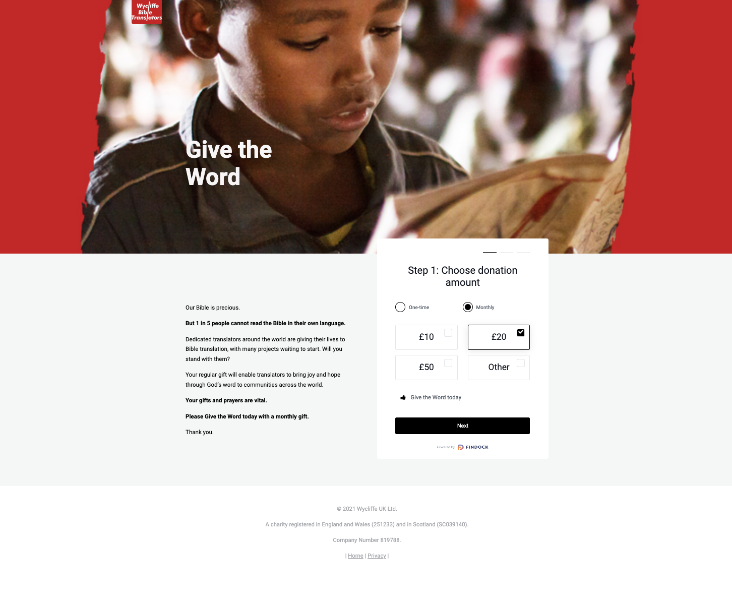
Wycliffe Bible Translators does a great job at focussing the donor on the mission and how their support will help the organization in achieving its mission impact.
Build trust through brand consistency and familiarity
It might seem obvious, but it’s important to make sure that donors immediately recognize your donation page as belonging to your organization. Simple things like ensuring your logo is there, using your brand colours and images, and leveraging your organization’s brand voice are really critical to building trust; a second eye can help you spot minor errors, and also in general help you improve the content.
It sometimes takes time to build trust, so if you’re engaging with a new audience, best to lean on a page layout/ standard UI that donors are already familiar with, which will make it less ‘risky’ for them to complete an action on your page.
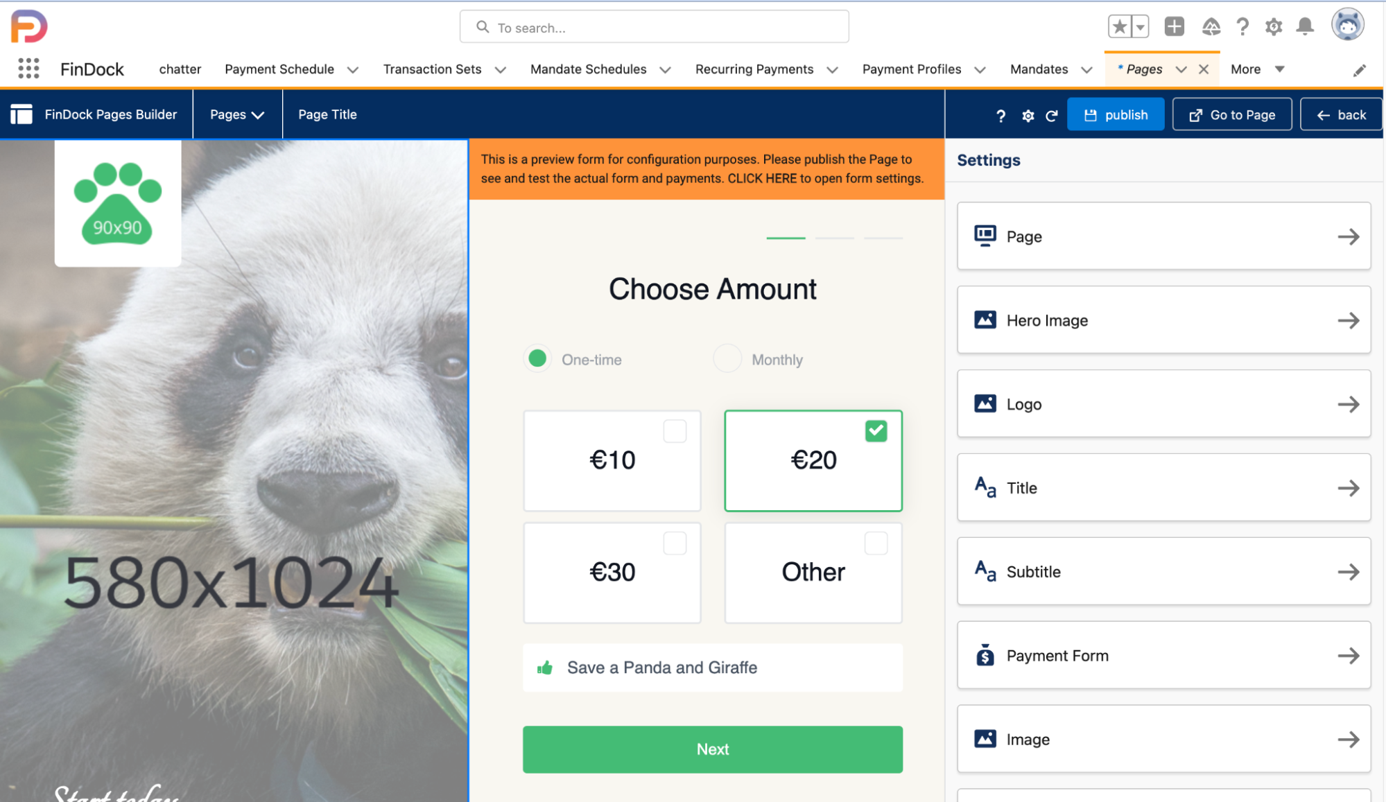
It’s easy to customize your donation page with the Giving Pages wysiwyg editor. Add colour palettes, upload your logo and choose from a number of modern, responsive layouts.
Strengthen your page with strong visuals
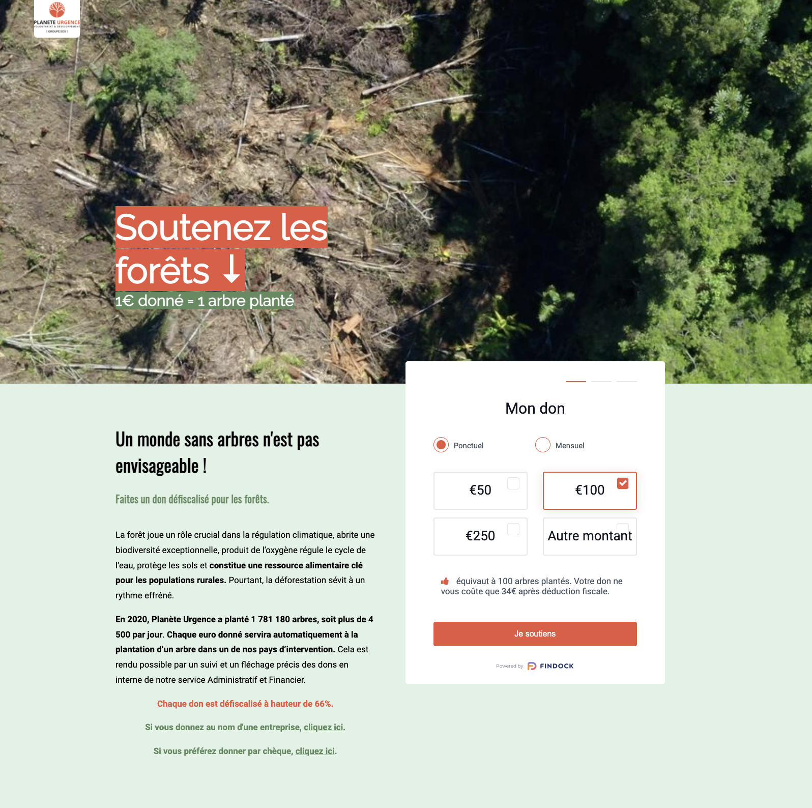
The first thing your visitors see when they land on your donation page is the main (or “hero”) image. This plays an important role in communicating the causes your organization supports. And it can also heavily impact bounce rates. Try testing different images to see which both converts the most and also impacts the bounce rate.
Here, we see how French nonprofit, Planete Urgence uses a strong visual to show the impact of deforestation, helping potential donors understand what the organization’s mission is about.
Fundraisers Tip: Remember, a high bounce rate can also mean that the link the potential donor clicked or the ad text didn’t match up to what they’re seeing on the donation page. Always think of a donor experience as steps in a continuous, integrated and consistent journey.
Tailor donation pages to different audiences
Most nonprofits will have a main donation page on their website, but you can also think about having additional donation pages to serve different markets/ personas or for special appeals during the year.
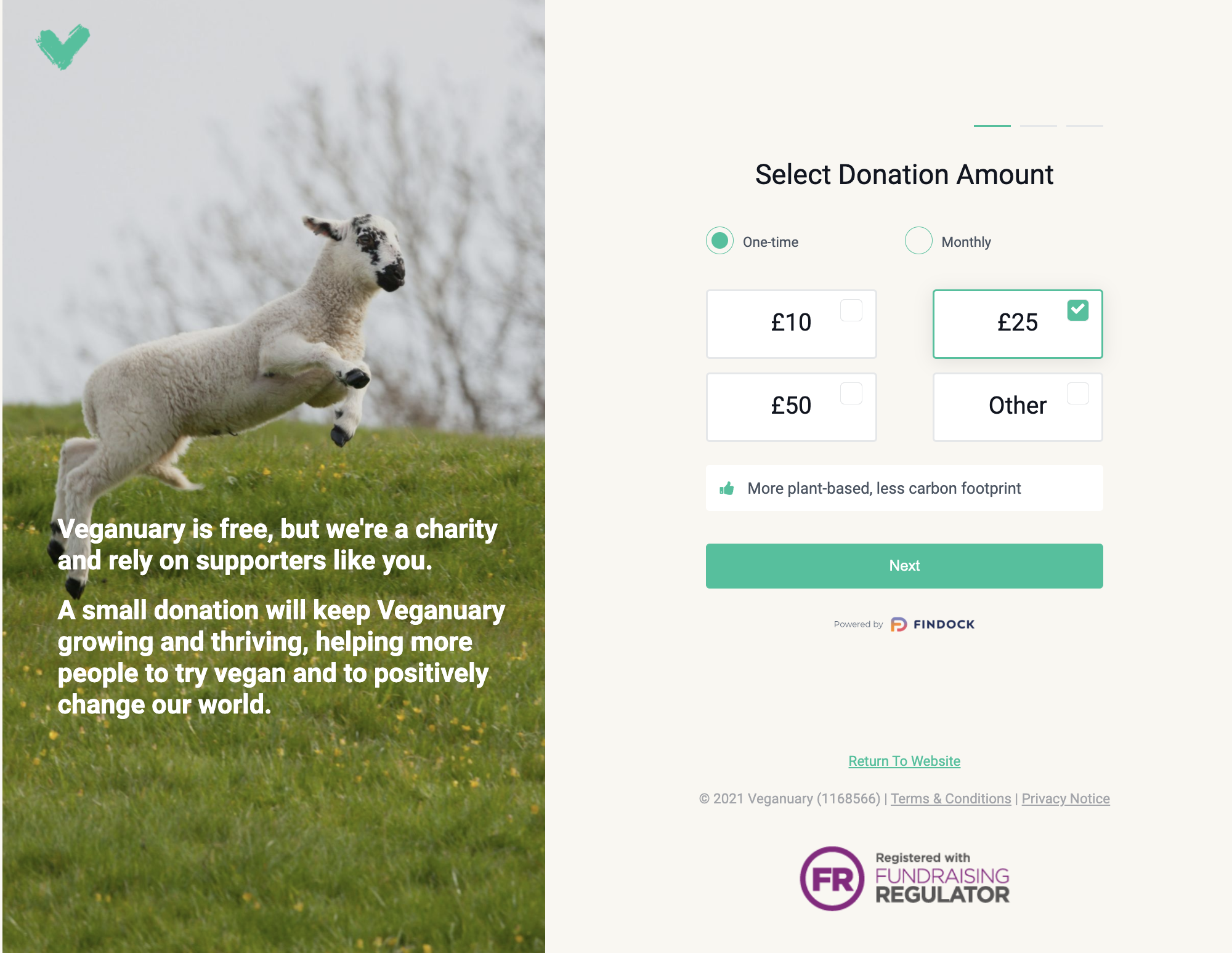
UK based nonprofit, Veganuary rallies a lot of support in December and January but knows that in order to reach as many people as possible it must segment its campaigns. With Giving Pages, the team easily sets up different donation pages tailored to different audiences around the world.
Continue the conversation and build a relationship with donors
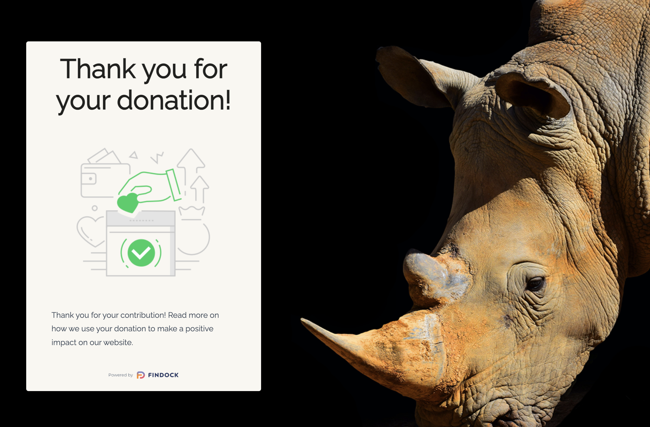
Your donation page could be the first step in a long-term relationship with a donor. Remember to send them a thank-you note following every donation and design an ongoing journey to continue the interaction and increase the likelihood of further engagement and value sharing.
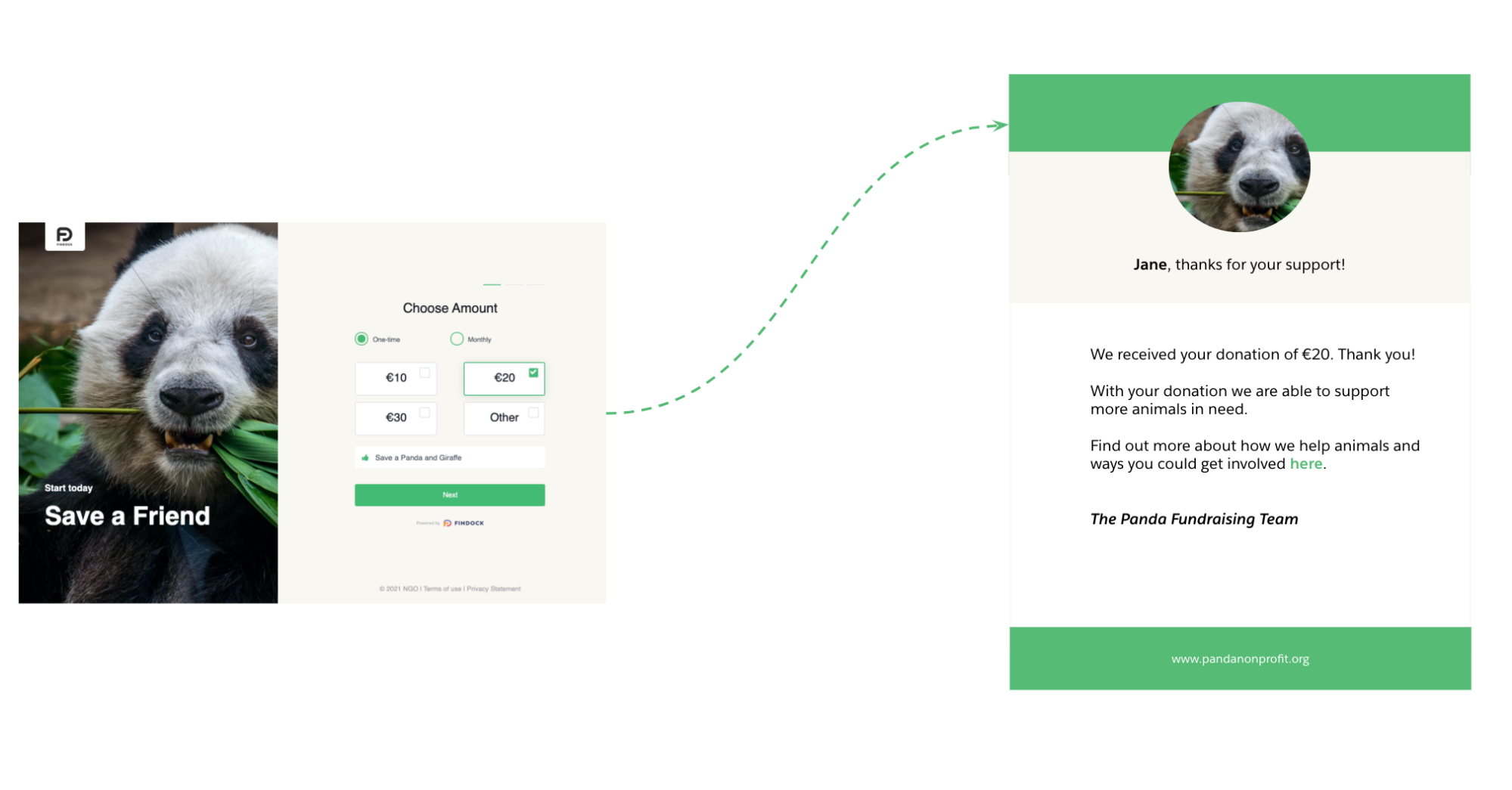
Use donor payment information captured by FinDock to trigger Salesforce Nonprofit Cloud engagement journeys.

Laurens Wapenaar
Product Manager
Laurens loves solving problems using technology. Heading up a Product team, Laurens makes sure FinDock continuously delights its customers with new features and enhanced capabilities. In his spare time, you’ll find him geeking out on fantasy, history and tech books, board games or hiking with family and friends.
