FinDock Brand Guide
The FinDock brand in a nutshell: our logos, colors and guidelines.
![FINDOCK_logo_liggend_1_PRIMAIR_[RGB] FinDock logo horizontal](https://findock.com/wp-content/uploads/2021/07/FINDOCK_logo_liggend_1_PRIMAIR_RGB-1.png)
![FINDOCK_logo_square[RGB] FinDock logo square](https://findock.com/wp-content/uploads/2022/01/FINDOCK_logo_squareRGB-257x300.png)
Included file formats in the FinDock logo pack: EPS, JPG, PNG, SVG + gradients
![FINDOCK_logo_liggend_1_PRIMAIR_[RGB] FinDock logo horizontal](https://findock.com/wp-content/uploads/2021/07/FINDOCK_logo_liggend_1_PRIMAIR_RGB-1-300x63.png)
How to use the FinDock logo
The logo can be used three ways:
- The primary logo on a white background
- An all-white logo on a blue background
- An all-white logo on a gradient background

How not to use the logo
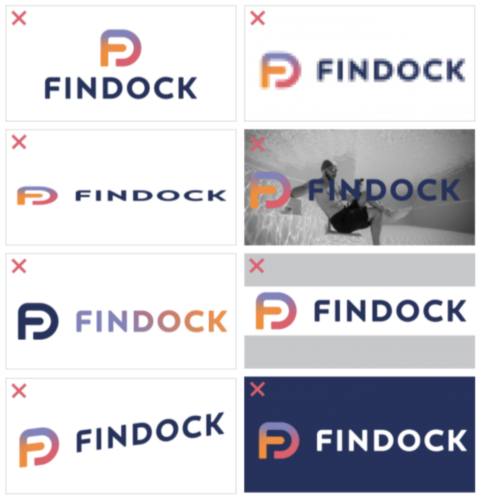
Do not use the logo in the ways illustrated to the right and explained below:
- Don’t transform the logo.
- Don’t change the resolution.
- Don’t scale without keeping original proportions.
- Don’t use the colored logo on a photo.
- Don’t change the colors of the image and name.
- Use the transparent PNG whenever possible.
- Only use the colored logo on a white background.

FinDock Colors
The FinDock Brand Guide contains four colors. The main color is Indigo, a solid dark blue color. It’s accompanied by three contemporary secondary colors. These colors flow organically into each other.
| Color name | RGB | CMYK | HEX | Example |
|
Indigo |
36,49,94 |
100,86,33,25 |
#24315E |
|
| Living Coral | 236,87,107 | 00,78,43,00 |
#EC576B |
|
| Tangerine | 255,139,47 |
00,55,83,00 |
#FF8B2F | |
| Amethist | 131,131,192 |
56,50,00,00 |
#8383C0 |
FinDock Typography
The font used for the entire corporate identity is Montserrat. Only the Regular, SemiBold and Bold styles are used.
Alongside are a number of examples for plain text, subheadings and introduction. In the event that the Montserrat cannot be used – for example in some Microsoft Office programs, a replacement font can be used: Arial (Regular / Bold).
| Element | Style | Color | |
|
Heading |
Montserrat SemiBold, 22/22pt |
Indigo #24315E |
|
| Alternative Header |
Montserrat SemiBold, 22/22pt | Living Coral #EC576B | |
| Introduction | Montserrat SemiBold, 12/15pt |
Indigo #24315E |
|
| Paragraph | Montserrat Regular, 10/15pt |
Indigo #24315E0 |
